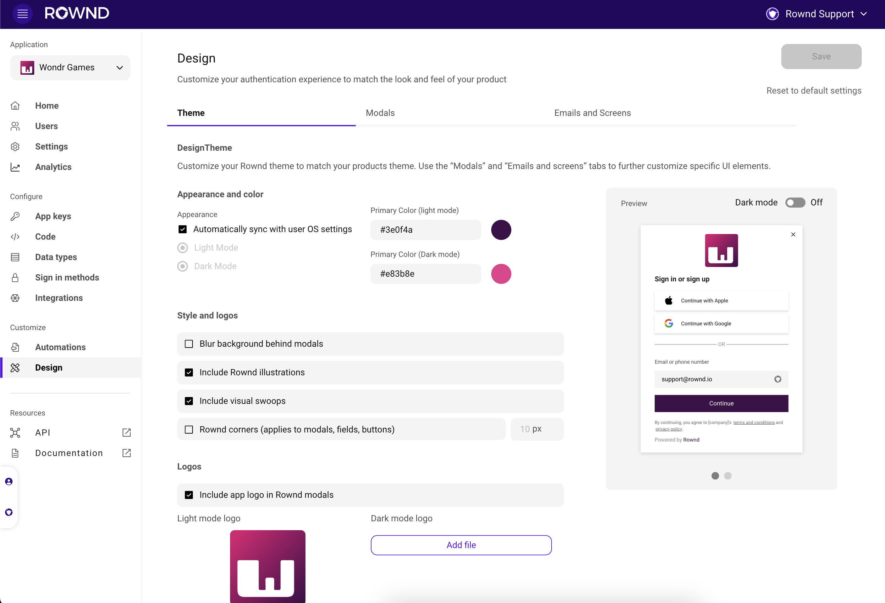
Elements you can customize
- Appearance. Depending on your application, you can decide if you want your styles to 1. Automatically sync with user OS settings, 2. Always appear in light mode or 3. Always appear in dark mode. The default setting is to automatically sync to user OS setting.
-
Primary color. Rownd’s default primary color is Purple
#5B13DF. You can change this color to match your brand color. Additionally, if you are using dark mode or syncing to user OS settings, you can add a primary color for dark mode. Use the Dark mode toggle in the preview on the right to see your dark mode color in the preview. - Overlay blurring. By default, overlays (behind modals) blur the background. You can leave this on or turn it off.
- Visual elements. Most Rownd dialogs include “visual swoops” at the bottom that match the primary color you select. You can choose to remove these for your application. Rownd also includes default illustrations that appear on varying modals. You can choose to remove these as well.
- Corner radiuses. By default, Rownd modal and hub corners have rounded edges; you can choose between rounded and square corners on UI elements.
- Logos. Logos can be added to sign in modals by checking the box to “Include app logo in Rownd modals.” You may add separate logos for light and dark mode or upload the same logo for both appearances.
How to customize
- In the Rownd dashboard, navigate to the Design tab from the left navigation.
- Edit and change dark mode options, the primary color, corners, background blur, and visual elements with the options on the left side of the screen.
- Preview your changes in an example UI dialog on the right side of the screen.
- Press Save in the top-right corner before leaving the page. Your updates will be applied to the websites and apps where you’ve installed the Rownd code snippet.
Additional UI customizations
Global styles will span across all Rownd UI elements, but you have additional customization options for the content and appearances of Rownd emails, modals, and screens.- Email customizations. Customize the language and logo that appear in user verification emails for email sign in.
- Sign in modal. From the “Modals” tab, you can update the content, visuals, and links on your Rownd sign in modal.
- Verification modal. From the “Modals” tab, you can update the content and visuals on your Rownd verification modal.
- App download screen. From the “Emails and screens” tab, you can update the content and visuals on the Rownd App download screen. This screen appears if your user is attempting mobile app sign in and does not yet have the app on their device. Be sure to configure your mobile app settings for this to work properly.
If your app is already in production, you may want to create a second Rownd app in order to test your changes before applying them to your live environment.
You can use the Reset to default settings option on the right side of the page
to reset the style to the Rownd defaults.